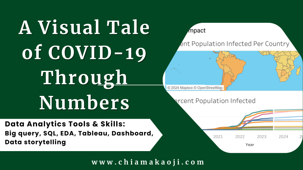
COVID-19 hit the world in 2020. This report dives into the insights I’ve uncovered from studying numbers related to cases encountered, deaths and vaccinations. Using SQL and Tableau, I’ve translated these numbers into a visual story to help us understand the impact of the pandemic.
Aim
My goal is to create a visual story that makes it easier to see patterns, differences, and trends in COVID-19 data. This, in turn, can help us make informed decisions and contribute to a global response.
Data Collection
I started by gathering data from Our World in Data and then carefully selected and organized it using Excel. I then used SQL for a deeper analysis.
Data Cleaning and Processing in SQL
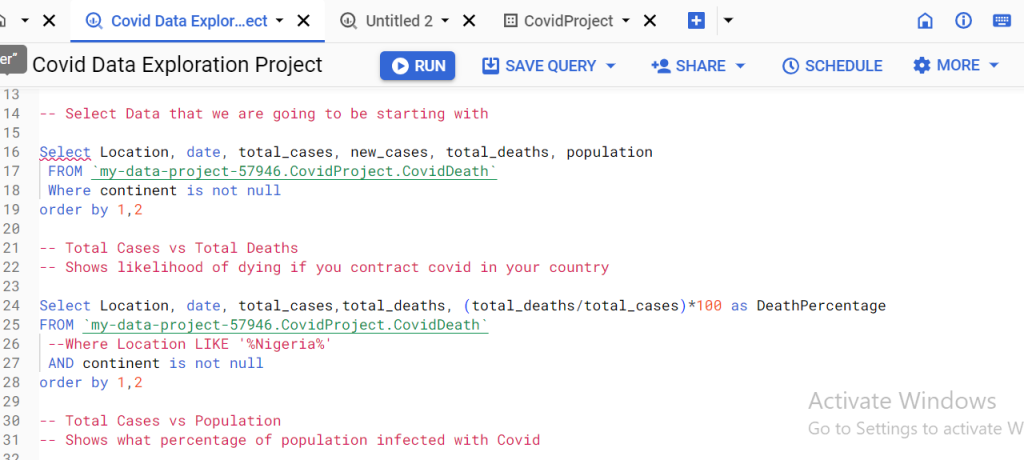
I used BigQuery SQL functions like SELECT, FROM, JOIN, WHERE, ORDER BY, GROUP BY, and others to clean and organize the data. It’s like getting the data ready for a big party – making sure everything is in order.
Here is the link to the GitHub codes.
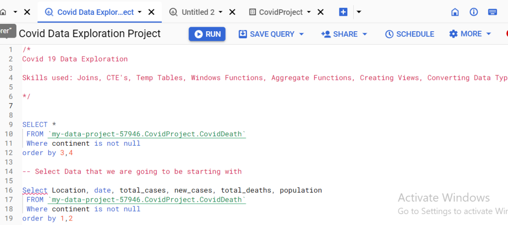
Exploratory Data Analysis in SQL
My journey into the data revealed some big numbers: a death rate of 0.92%, a whopping 769,386,068 total cases, and a sad total death toll of 7,081,774. We also found that Europe took the hardest death hit, followed by Asia, North America, South America, Africa, and Oceania.
I also observed a 62.67% vaccination worldwide, with the highest figure in the continent of Asia.

Dashboard Creation
Using Tableau, we turned our insights into an interactive story. The map showed the death percentage per infected people in different countries, and a trendline chart tracked how infections changed over time in selected countries.

Conclusion
Through our data journey, we’ve glimpsed the complex world of COVID-19. The dashboard helps us see the big picture and highlights the impact of Covid 19 and areas to reinforce interventions and other responses to pandemics like this.
Recommendation
With these insights, decision-makers can better plan and respond to the challenges posed by COVID-19. Here are three recommendations:
A. Implement Targeted Vaccination Campaigns: Leverage the insights from the dashboard’s visualizations to identify regions and demographics with higher infection rates. Tailor vaccination campaigns to target these specific areas, ensuring a more focused and efficient distribution of resources. By concentrating efforts where they are most needed, public health officials can make a significant impact on reducing the overall spread of the virus.
B. Enhance Public Awareness and Education Initiatives: Utilize the interactive map showcasing the percentage of the population infected in each country to prioritize areas with lower awareness or compliance rates. Develop targeted public awareness and education campaigns to inform communities about the importance of vaccinations, preventive measures, and the current state of the pandemic. Informed and educated communities are more likely to adopt necessary precautions and contribute to the overall success of public health initiatives.
C. Adapt Strategies Based on Trendline Analysis: Regularly monitor the trendline chart illustrating the percent population infected over time for different countries. Use this dynamic tool to identify emerging patterns and anticipate potential outbreaks. Implement proactive measures, such as increased testing, contact tracing, and resource allocation, in regions where the trendline indicates a rising infection rate. This real-time adaptation ensures a more responsive and resilient public health strategy in the face of evolving challenges.
In the world of data and analysis, this report stands as a guide – using information to navigate the uncertain times of the pandemic. May these insights light the way as we work together to overcome this global health crisis.