Ever wondered how emergency room activities can be optimized?
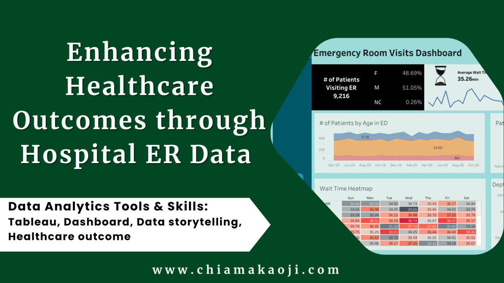
I embarked on a journey to help you with that – inspired by Josh Matlock’s of Data Wizardry. This report unveils an Emergency Room (ER) dashboard created using Tableau. Rooted in Real World Fake Data from www.data.world, this dashboard presents a holistic view of ER operations, shedding light on crucial factors such as patient demographics, wait times, satisfaction scores, and department referrals.
Problem Statement
Emergency Rooms are busy places where doctors and nurses try to work efficiently while making sure patients have a good experience. This report wants to give a full picture of how Emergency Rooms work by looking at the data. It shares helpful information for people in charge of managing healthcare.
Aim
My objective is to harness the power of data to empower stakeholders with an insight into ER operations. By delving into patient numbers, demographics, wait times, and satisfaction scores, we craft a narrative that guides decision-making, ultimately enhancing the quality of emergency care.
Emergency Room Dashboard Components
Here is a LINK to the Tableau interactive dashboard.
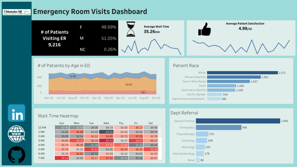
- Number of Patients, Gender, Age: Visualizing the demographic distribution of patients provides insights into the diversity of individuals seeking emergency care. This section unveils the gender and age composition, aiding in resource allocation and personalized patient care.
- Average Wait Time and Heatmap: The heartbeat of the ER – average wait time – is dissected by day and time, offering a dynamic Heatmap. This empowers stakeholders to identify peak periods and optimize staffing, ensuring efficient patient flow and minimizing wait times.
- Patient Satisfaction and Referrals: Understanding patient experiences is paramount. By examining average patient satisfaction scores and department referrals, stakeholders gain valuable insights into the effectiveness of ER services and can implement improvements to enhance overall patient care.
Importance of the ER Tableau Dashboard
The ER dashboard serves as a compass for healthcare decision-makers, providing a real-time, data-driven understanding of the critical factors influencing emergency care delivery. It fosters a culture of continuous improvement and proactive resource management.
Recommendations to Stakeholders
For a similar dashboard built for your hospital, here are some recommendations:
- Optimize Staffing during Peak Hours: Leverage the Heatmap feature to identify and prepare for high-traffic periods. By adjusting staffing levels during peak hours, hospitals can enhance efficiency, minimize patient wait times, and maintain quality care delivery.
- Enhance Patient Experience and Quality of Care: Regularly monitor patient satisfaction scores and delve into the associated factors influencing dissatisfaction. Implement targeted improvements based on feedback to elevate the overall patient experience and ensure consistently high-quality care.
- Streamline Department Referrals for Seamless Care: Analyze department referral patterns to identify bottlenecks or areas of improvement in the referral process. Streamlining referrals ensures a smoother transition between departments, reducing delays and enhancing the continuum of care for patients.
In the dynamic world of emergency care, an ER dashboard like this isn’t just a visualization tool – it’s a strategic guide, arming stakeholders with the insights needed to navigate the complexities of emergency rooms and deliver optimal patient outcomes.